
Sagwitch was a great Indian Chief. At the end of the 19th century he fought against overwhelming forces in order to save his people. In 1971 his great-grandson, Jon Trent Warner, was born – proof of Sagwitch's victory.
My reference for this drawing was a photo I took of
I do my drawings for my own study. It is my goal to master tools and techniques; to remember all the rules. Here are some of the tools I am attempting to master. Lots of pencils; Guptill recommends one mark different harnesses with colors to make it possible to quickly identify them. I sharpen them with a pocket knife, polishing them with sandpaper, and wipe the points clean with tissue. I use several different erasers: kneaded, white, and the ones at the ends of my Ticonderoga #2’s. I recently bought an electric eraser. It is very nice for removing unwanted construction lines. The brush and the feather are from removing eraser dust. Once the drawing is done, I fix it with a spray.

There are advantages in sketching from a photo rather than from three dimensional objects, although there are draw backs as well. With a clear ruler I can exactly place landmark points. As R. B. Hale says, to draw lines one needs to know the points at which they begin and end. The templates are especially helpful in drawing eyes. Another important tool I learned about from Guptill is the eraser shield. I’ve seen is referred to a dental floss for one's drawings. It enables the removal of unwanted marks and lines without damaging those one wants to keep.


.
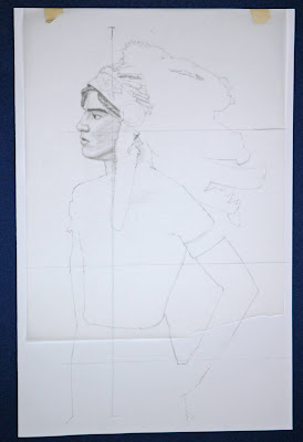
The Drawing begins with a very carefully measured sketch. Guptill advises that one block out the drawing very lightly with the pencil barley touching the paper.

.
Once the “edges” are established, Guptill advises that the figure be subdivided and small details be expresses, while retaining the larger characteristics. Once this is done the construction lines can be erased.
With the line drawing complete, it is time to add value.
Guptill suggests that the values be applied and practiced on a piece of tracing paper placed over the line drawing. I've found this to be a great way to build confidence without risking my drawing. It allows the retention of construction lines from which to measure and allows for the placing of contours without locking the construction lines in place. It also allows for contour lines to be sketched in without having to place them on the actual surface of the artwork. Mistakes can be made – and fixed – without consequence.
Look through the tracing paper pictured below and you can see the values of the face.
Look through the tracing paper pictured below and you can see the values of the face.

.
Here the tracing paper is “in place” over the drawing, allowing experimentation and practice while protecting the drawing.

.
Once I have tried the values out on the tracing paper, I remove the construction lines and re-apply the shading directly on the drawing. In this case I found the feathers even more challenging than the face. It took a lot of careful measurement to get the feather patterns expressed. I did them very lightly at first, making them more intense by degrees as I became satisfied with the effects. The white feathers have been slightly grayed by placing lines in rhythm with the “veins” of the feathers. The red fluffs are in gray, the black dyed tips developed with darker and darker parallel lines. The red felt wrappings are a chance to express the form of the feathers by shading them as cylinders.
I developed the white fluff by concentrating on the edges and keeping everything else as white as possible. It was the same with the ermine dangles.
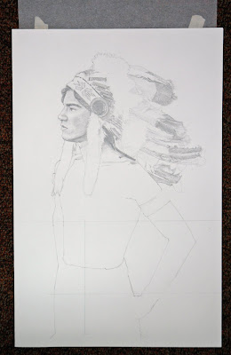
I developed the white fluff by concentrating on the edges and keeping everything else as white as possible. It was the same with the ermine dangles.

Tracing paper also allows the careful placement of detail contours.

.
Guptill suggests three stages for making a line drawing into a value sketch.
Stage #1 - Think of the exact. Consider degrees of light and shade (dark). Translate the value of color into values of light and dark.
Stage #2 – Make the outline drawing. Add (lightly) contours of areas of light or shade. [This can be done either on the paper, on a printed copy of the line drawing, or on tracing paper placed over the line drawing.] Determine the lightest light and the darkest dark and make comparison to other values. Sharpen a medium soft pencil to a fairly sharp point. Work for darkest to lightest; building up all tones gradually. Finally, set the drawing back often – get away from it once in a while.
Stage #3 – Compare – do you have the exact degrees of light and dark in the drawing as in the object, [reference]. Compare – the exact degrees of sharpness and softness in the edges. Ask questions: Is there is too much dark at one side or at the bottom? Does the whole hold together nicely? Are the shadows clear and transparent, or heavy and dead? Has one succeeded in expressing space, depth, weight, texture? Has one expressed economy in tone or is the drawing confused by to many different values? Has the outline been lost, as it should be? Do the nearer parts come forward properly? Do the farther parts go back? (If not force the nearer – sacrifice the distant!) Is there complexity of highlight? (If so, tone down all but one. Have one lightest light and one darkest dark.)

Next – Anatomy! I always have my anatomy books available. Among the many books I checked while drawing this picture were Joseph Sheppard’s Anatomy and Very Basic Art Lessons by me. On the tracing paper I sketched in the muscles of the stomach, side, and beneath the arm.

At this point I realized I had not clearly established the ribcage under the muscle groups so I add it onto the tracing paper then transferred it to the drawing.


Once the anatomy was ruffed out I consulted art works I admire to help fine tune the forms.

With the line of the ribcage as reference I put in the muscles and then almost entirely removed the construction lines, the lines that indicate what I know but cannot see.

Now it is was matter of placing the values over the form. The reference indicates where the lights and darks go. As R. B. Hale explains, one must draw with the mind and the rules as well as with the eyes and tools. "One must draw what one knows not just what one sees."
I try to apply all the pencil to the drawing in a uniform right to left 45 degree angle series of lines. Kamille Cory taught this to me when I was lucky enough to be her student. Guptill demands the same. I change between flat and very pointed pencils, depending on the size of the area I seek to cover. I sharpen my pencil often to maintain the crispness of the outlines.

Next, I follow Guptill's injunction. I look and check, ajust and check again.


Shading creates the illusion of form. I shaded for a cylinder for the upper arm, and squared up the lower arm by shading its block like shape. I also used my oval drawing tool to establish the "perfect" circle of the iris.

I put in cast shadows – very carefully. R. B. Hale insists one remain the master of the cast shadows; they must not over power the drawing. I tried to ignore those that confused the shapes I was seeking to portray. I tried to make my shadows as “transparent” as possible and applied coats of fixative once I had them were I wanted them. Any slight change now would take on significance.

I put in the darkest darks; trying to reserve one darkest focus – his hair – and one lightest highlight – the fluffs of feathers and fur. I selectively clarified lines that divide shapes, especially those that indicate overlapping of forms. I tried to make gradual light shift between merging plans.

I add my last dark emphasis lines to indicate color and shading differences, signed my name, and add the date. Finally I covered the drawing with a coat of fixative. There was not turning back.

No comments:
Post a Comment